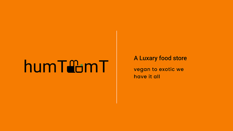
humTdumT
the logo is about an online grocery store, it primarily focuses on fresh, healthy food for the family. I tried to keep things simple but creative. While shopping in grocery stores we carry baskets, so I decided to design the letter "d" & "u" in the shape of a basket with some green leaf to represent fresh and healthy vegetables. I am new to this field, your suggestions and feedback will be helpful for me.
More by Arup Sarkar View profile
Like
