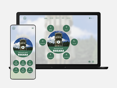
National park Kozara
The official website of the National park Kozara has outdated look. I think I bring life to this site.
I used material icons, Inter and Alfa Slab One fonts.
My goal was to have as clean as possible interfaces with the key features of the park. So, I used green to simples the park and grass and white (f2f2f2) a for modern look and feel.
More by Slaven Đervida View profile
Like
