Coffeecakekisses.com website redesign. My vision of how it would

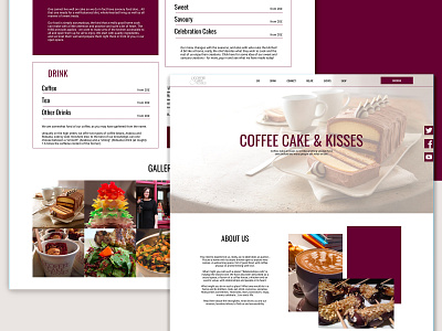
In my vision, the current website is overwhelmed with tons of information, wherever, the point is, at first, to show how this place is special and what it can offer to visitors. That's why I placed the information the way I did (you'll see it on the screenshot).
I removed from the main menu several points that can be place in other parts of the first page as they are not really crucial for visitors.
Moreover, now the main page is not very informative and I placed there the information that may be useful for those who's choosing the place for some celebration, for example.
The gallery in the middle is also a very important point in playing with visitors' attention. There should be something placed in the middle of information given, so people visiting this website weren't bored until they scroll to the bottom of the page and could be distracted a bit and then continue riding.
As for colours, now the header with very bright pink may not be very pleasant to eyes and it's recommended to make bright accents and not doing the whole menu in this colour. There are some exceptions, for ex. if we talk about attracting attention by the form on the website that user should fill in, but it is not in this case.