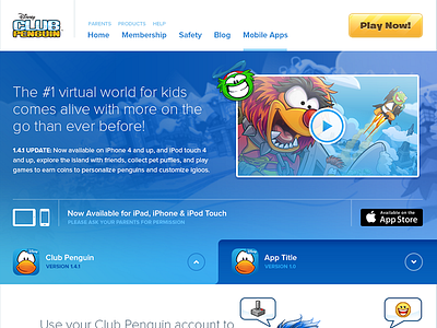
Apps Page Exploration
I was recently tasked with re-imagining the landing page for our mobile apps section of the website. Our current apps page features our primary app only and doesn't leave room for any new apps we may have the in future. Additionally the page content is recycled from the descriptions available on the app store. Overall, it's pretty bland and doesn't communicate the benefits of a connected experience that's available on iPhone, iPad, iPod or the desktop client.
The design itself is in a completely different style used to explore new styles and applications that may inspire future iterations of the website.
More by Ryan Le Roux View profile
Like

