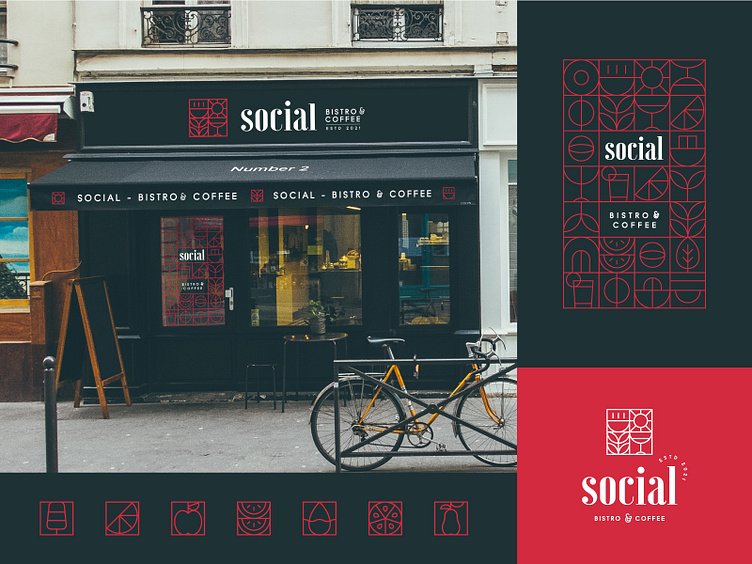
Visual style and facade simulation
Showcasing examples of visual elements derived from the logo, that help the brand communicate and position itself in the market.
The geometric approach serves as a flexible channel between the bistro and the customer, simplifying the link between the two, whilst ensuring a consistent visual style across the brand.
Smash that "L" button dude!
Cheers!
More by mrr - Mark Razvan Repa View profile
Like

