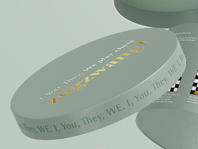
Round Chess Lid Packaging Design
I used neutral green colour and tried to make the design quite minimalistic. So the busiest place on packaging design would be chess instructions that would grab the attention, not a gendered visual appearance like it is traditionally emphasized on the chess packaging. It is all about the game, not the gender.
The typeface is contrast sans-serif, which is neither feminine, nor masculine, but modern and yet classic in appearance.
More by Paulina Starikovaite View profile
Like
