Tychon Brand
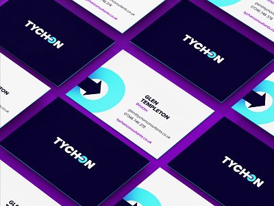
The brand is based on the greek mythology of the word Tychon; meaning hitting the mark. It features a clever logotype with an arrow stemming from the 'H' into the middle of the 'O' symbolising an arrow going towards a target. This symbol is repeated throughout the brand collateral.
The brand features an exciting colour palette of electric blue and purple against a deep blue. This will ensure that Tychon stands out from its competitors. We have paired the colour palette with an equally bold san-serif font; Proxima Nova. This allows the message to be powerful in its delivery.
More by KIJO View profile
Like


