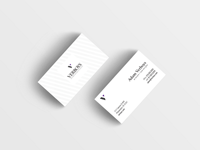
Business Card Design for local Interior Designer
The client wanted to appear very high-end and classy but also simple. I used a simple grey-toned pattern on the front, and a ton of white space on the back to achieve a balanced classy card.
More by Michael Greenspoon View profile
Like
