Why settle with just grey?
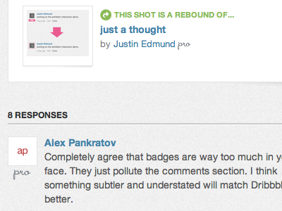
Was thinking about this some more, and I decided the best way to display a pro account would be to go subtle, and not in your face. Pink on Dribbble is usually denoting a call to action, and for devices like the iPhone and iPad actually being able to see the pro badge on hover is tricky.
So I’ve done two examples of what I think the badge should look like, one inline with the player name, one below the player icon. It’s not intrusive, doesn’t make the pro badge look like a call to action every time it is displayed, but shows the pro status more elegantly than the current set up.
In any case I would like to see the badge changed! :-)
More by Ben Briggs View profile
Like
