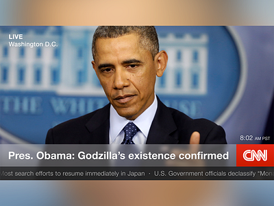
CNN TV Redesign
A fun evening design exercise. I'm pretty sure that every single 24-hour news network looks awful on TV. This is a "simpler" version of CNN with better typography and less visual noise. I think transparent-chrome could work really well in a video-centric environment such as the news.
More by Noah Batterson View profile
Like
