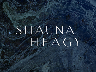
SH Logo // In Progress
Hey Dribbble friends, I could use your feedback on this logo. In order to get the A&Y to align, and also the two H's, I had to make some letters a lot wider than others, and also track out the bottom line more than the top. Does it come off as awkward or forced? Does the last letter read easily as a Y? I've been looking at it too long to tell.
More by Seth Nickerson View profile
Like
