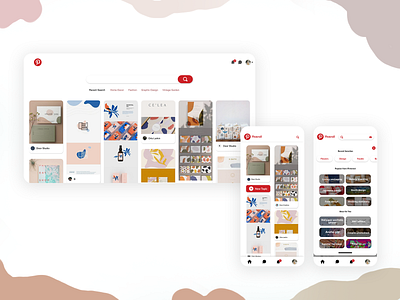
Redesign of the Pinterest
Hi there,
I'd like to share the redesign of the Pinterest landing page.
I made the page more clear by leaving more white space on the header and removing the description of the pictures (Users can read the description on the second layer if they are interested in the content)
Let me know if you have any comments or ideas.
Hope you like it!
More by Lucy Hsu View profile
Like
