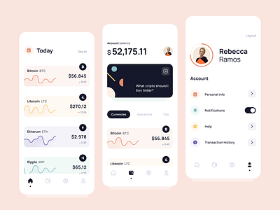
Cryptocurrency app
Occasionally I like to challenge myself to do an experiment different from what I'm used to doing. Looking at my portfolio, I realized that some of the last works I did as a case study, were visually saturated: some excesses of colors for a proposal for an application for condominiums, and of course, a saturation of three-dimensional effects for an aligned application experiment to Neumorphism (a super problematic trend, but I have to confess, that it is fun to explore).
This time, I decided to take a slightly different path. I started by creating a simpler color palette, I reduced the most eye-catching visual effects, such as shadows, to a minimum and took the risk of imposing a visual lightness that was somewhat rare in my last interface experiments. The result is this, an interface designed for a user who invests in cryptocurrencies, who tries to highlight the most important information for him while transforming complex items such as numbers and graphics, into smooth and potentially harmonic manifestations.
What did you think? I'll be very happy to receive feedbacks :)
