Koiné Forlì - Website Design
In April 2021 I had the pleasure to work with Associazione Universitaria Koiné ONLUS, in regards to a project which is super important nowadays for everyone who has to be present in a community of people; that is, their own website.
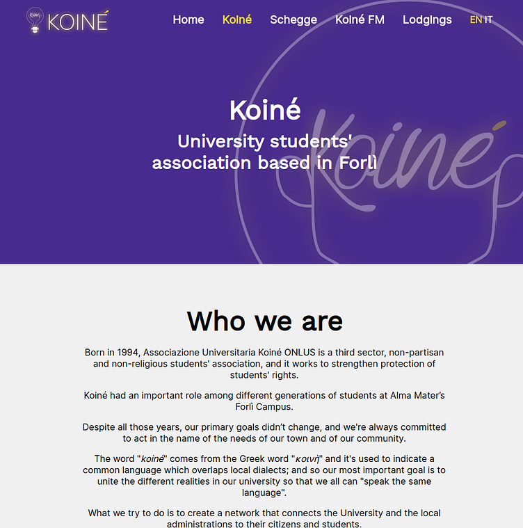
The website design had to be simple and accessible from desktop and mobile; plus, it had to be consistent with the color schemes and logo designs that were already in place. After a week or so of negotiations, we settled on four colors (black, white, a dark accent which in this case is purple, and a light accent which in this case is yellow) and we defined some rules to avoid contrast issues that could cause the content to be unreadable under certain conditions (for example, we had to define eight button styles so that the buttons themselves could be matched on different content and still grab the attention of the user).
A lot of thought was put into making sure that under any circumstance, the user should be able to read the content clearly. Grayscale renditions of the content are great in contrast, therefore making the website able to be printed without many issues (which also has a super nice side effect: colorblind people can read the content clearly too!) Also, we do offer a proper dark mode in browsers that request it.
The website was carefully made from designs to code in just about a month. It is reachable at https://koineforli.it
