LLH Dribbble Image
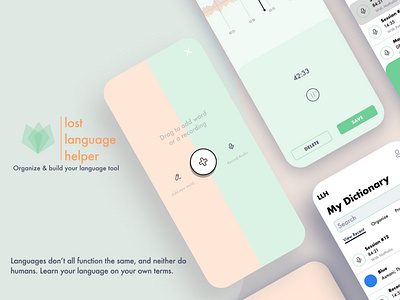
- Layout is designed to be simple, and to remind the user of the two core values: organization and customization. I decided to put several features aside and try to deliver the most simple organization product I could.
- Target user is a language learner that is frustrated with existing language learning applications. All applications have pre-described categories that tell the user how to learn language. LLH will allow the user to construct their own tool that will be most helpful in learning the language. The app is designed to be as simple and clean as possible to appeal to less tech-literate users.
- I used Futura for the primary font in my design system. It is modern and legible, and toes the line between fun and serious well. I liked its versatility for stark and bold headings, while legible and simple for use in smaller sizes.
- Green is my primary brand color. Green subliminally signifies success, achievement, and accomplishment in color psychology. I wanted a subtle green that addressed the target persona as a potentially worn-out, over-stimulated language learner. The soft green should give a calm, less intense feel that encourages the user to keep going while reminding them of the work they've accomplished. Orange as a secondary brand color is a contrast to green, but I also worked with the opacity to give it an equal softness and fun feeling that would compliment the same feelings of its green counterpart.
- I am currently conducting user tests, and compiling feedback. I plan to make a v2 after some time and implement some design changes (most notably, the opening feature). But, this is how I envision the product working for my situation! I hope you enjoyed taking a look. I'm appreciative of any and all feedback!


