DiverCity Hub
This was a branding project for a community centre in the heart of Newcastle.
They wanted a brand identity system that would stand out from the crowd!
It was to be bold, modern and responsive and they did not want any people, hearts or hands.
This project took me a while to find the right direction as there wasn't anything similar I could draw inspiration from. I didn't charge for this project based on the fact they are a grassroots organisation and I believed in their cause.
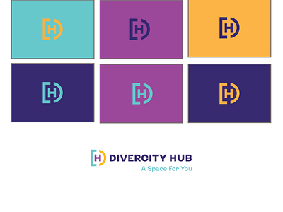
The mark is a monogram of DC and H and puts the hub at the centre with the diverse city surrounding it The D and the C are formed from a square and a circle coming together, representing diversity and together they create an overarching D showing how different groups can come together for one cause and to create a whole.
