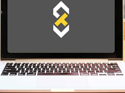
Lettermark for online education platform Steel Trap
YouTuber Will Patterson commissioned this logo for an upcoming video and set the brief.
This was to design a lettermark for an online education platform called 'Steel Trap' who wanted to come across as friendly, professional and experienced and include the colour yellow.
In my research I discovered steel trap is a saying relating to sharpness of mind. The trap itself looks aggressive and unfriendly but I thought about the properties of steel and how the S could be formed out of straight lines. This helped the T to fit in the centre and links in with the trap aspect.
I think it looks a bit like a logic problem which ties in with education and I paired this with a chunky friendly serif typeface to add character and experience.
I wanted to use mixed case as I felt that all caps was unfriendly but this proved difficult as I also wanted the words stacked.
To solve this problem I customised the T to reduce its height, thereby reducing the width of the space between the two words.
I used Affinity Designer on the iPad Pro.
