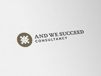
And We Succeed Logo [C]
So after the last black only design, the client and I had to find a compromise on the use of colour. I was strongly against the gold/purple combo that the client wanted, whilst I felt the all black version did the job.
However, listening to the client I persisted and looked at various options. I think we have settled on a solution that we both like. It's a reversed logomark this time round and coloured with a Pantone Metallic 'muted' Gold, with the type being a dark charcoal.
The client also pointed out that as well as the logomark being formed from a compass and jigsaw piece, the overall effect hints at 4 tabled people. Which she said is perfect for the line of work she does, so bonus 'fluke' points there.
I still prefer the previous all black version, but this is mostly a personal preference, but happy with this option.
The gold help reinforce the 'succeed' nature of her business, but the muted version of gold is not so flash or arrogant, more understated.
At this point, the client is still debating which option, all black or this one.

