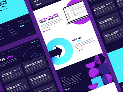
Tychon Website
How does your website deliver technical information without losing user attention?
Our solution: break up details and highlight calls to action with an Animated User Experience. Our latest website design for Tychon, an R&D consultancy firm, is full of animation and a great UX, smashing our highest scores on both CSS Design Awards and Awwwards.com.
We used micro-interactions in the buttons, navigation and enquiry form to encourage clickthrough. For pages articulating services, animated illustrations, parallax scrolling and an eye-catching animated background help avoid information-overload.
With strong typography and a bright colour palette, these designs include the brand’s “Arrow” imagery at many points, representing their key message of “hitting the mark”.

