Ken&Co Property Consultant Website
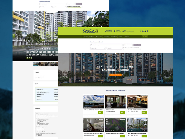
This is a throwback project that was found while organizing portfolio works and I think it would be interesting to share a little insight on how it was developed. You must be questioning the positioning of the layout for the property search form and the details that are placed on top of the header and so on.
First, this was formed after nearly a year of case studies that applied to different groups of people. Before this project was started, we were aware that the users based in the cities have a lower understanding of technology knowledge compare to other big cities so the common user experience that we can found in the market does not really apply effectively here. For example, they do not even know what is a toggle button. So, part of the website does require certain educations while guiding our users to navigate across our website.
Next would be the studies on how users react to the goal that we had planned for them. As you may check out the uploaded user interface design, we have a very clear message to deliver. The sequence of the journey in the website flows effectively to our target audiences. We use colours to differentiate the different call to actions. We came out with the different type of forms and elements to study the quickest journey on helping our users get the pieces of information they need.
In this project, this is where I have a deeper understanding and interest in designing a journey that targets our audience with a clear message and guidance. We used to think that pretty design is the key to keep our users to stay in our website but telling our audience the right message is actually more important because users land on your website for a purpose.