Product Item Card
oi folks ✋
This time I present how we solved an issue ux layout of our simpra product's item card.
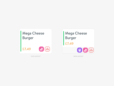
As you can see on the old version has a problem with price and icon area. The price and icons can overlay. So we had need to change some a new layout.
Now, even 5 icons can be possible puts on the bottom area without overlay any other item and It does not affect the icons even if the price is longer.
sweet hah?
Cheers
More by Arda Arıcan View profile
Like
