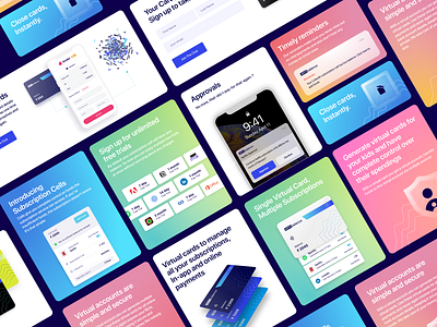
Website | Cards design
Here's another shot from designs of zero balance. The whole website is conceptualised using cards. Also experimented with glassmorphism with gradients.
What do you guys think?
Checkout live at : https://www.zerobalance.club/
--------------------------
If you enjoyed this shot, don't forget to press L before you leave!
Thanks for checking this project out! 👍 & stay tuned for more shots
More by yatrik raithatha View profile
Like
