SmartBud Exploration
Hey, community!
this is an exploration for the concept for of SmartBud.
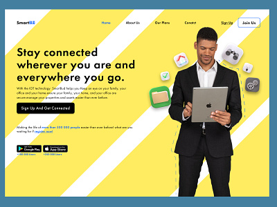
UI: I tried a light theme this time with a man who's trying to connect to approach the idea of staying connected.
UX: I kept it simple and used these colours that give the user a friendly feeling, I mentioned the number of users for the social proof aspect and to gain trust.
Copywriting: I choose to address directly the user and talked with an easy and clear message with a friendly accent.
tell me what you think!
Press L if you like it.
More by Dia Benatia View profile
Like
