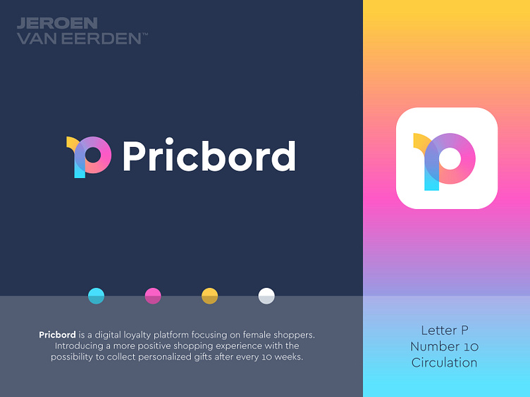
Pricbord - Logo Design v2
Pricbord - Logo Design v2
Pricbord is a digital loyalty platform focusing on female shoppers. Introducing a more positive shopping experience with the possibility to collect personalized gifts after every 10 weeks.
The idea of this concept was to combine the letter P with the number 10. As Pricbord uses a program that changes every 10 weeks. The vivid colors refer to positives and excitement when receiving a gift. As the mark is made out of one leading line, this also represents a timeline a user goes through when circulating through this platform within the 10 weeks time slots.
Currently open to hearing your feedback and if you perhaps saw anything similar been done before or not.
Interested in working with me? Let's make a mark, together!
More by Jeroen van Eerden View profile
Services by Jeroen van Eerden
Like

