Job card dark
Hey @Nazar Kulikov, I'd like to tell you a bit more about this card design process.
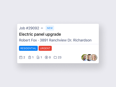
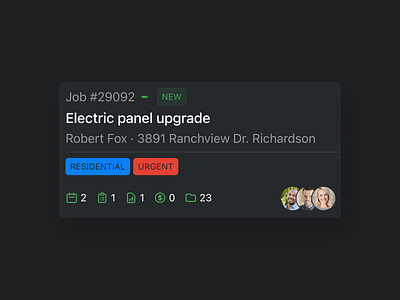
My first intention was to put the status badge (New) to the top right corner. It looked nice and balanced. But practically, I didn't like how the space between a job number and job status worked, I would like to make the seamless reading flow.
So, I've moved the status badge next to the job number but lost the balance ¯\_(ツ)_/¯
This is why I decided to add this icon, that shows some connection between a number and a status and also brings some balance back.
Also, I like how the overall layout works: not your usual card with things have put on the corners, let's say but something visually more readable (I believe). Perhaps I'm wrong, but I kinda like the result ;-)