Precipitatio (Cloud Computing)

While researching other cloud computing logos, I found that they were by-and-large exactly the same. Just a cloud, almost always, with some kind of very basic element to barely distinguish it. I wanted to stand out.
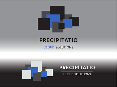
I always start with hexagons because I LOVE hexagons and I ALWAYS want hexagons to work, but they didn't work for me here (they rarely do, I'm used to it). Next was a sort of raindrop shape that I tried for much longer than I'm willing to admit to make them work.
I tried squares afterward, just sort of making my way down a list of shapes, and it ended up really working for me. The pixel-y nature of the squares made me feel "digital," while I spent a looong time laboring over perfect placement to get the right silhouette.
Let me know what you think and thank you for looking at my work!