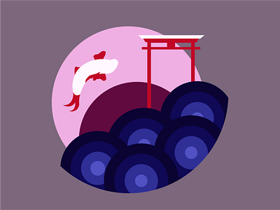
Aaron Tries His Best Logo
This about where I am after a month of learning, practicing, and consuming inspiration. At the start, I was a complete beginner. It could be better and I intend to revisit this design often as I improve for a very specific reason.
The meat of this process was conceptualization. I struggled. A lot. Defining yourself in a simple way is very difficult, especially when you have an existential crisis because you can't think of anything that succinctly describes you in any meaningful way, but it was in the midst of that spiral that inspiration struck.
I remembered the only tattoo I ever considered getting and my reason for it. The Chinese myth of the carp leaping over the Dragon's Gate and becoming a dragon, a symbol for dedication, hard work, and focus toward a goal. It's something I've always related to, aspired to, and ultimately often fallen from.
My journey in graphic design isn't going to be the same as other ventures. I'm a different person now than I was then. I'm committing to it like nothing I have before. I'm at the mouth of the river and I will leap the gate, someday. So... that's how I arrived here, at this.
Construction is fairly self-explanatory: simple shapes because they're more interpretive, purposely flat for preference. The gate is a torii which trends more toward Japanese than Chinese, as well as the color palette, but I sort of accidentally arrived at a torii while simplifying Chinese gates. Also, I'm more interested in Japanese styling than Chinese at the moment, so, as a personal work, it makes more sense for me as an interpretation.
So... that's my current personal branding. Advice and criticism always greatly appreciated! Thanks for looking!
