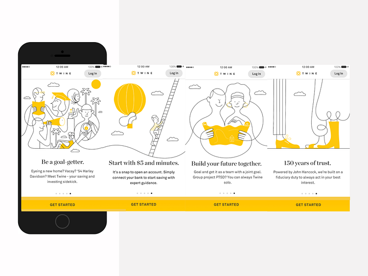
Twine onboarding carousel
As one of my first projects at Twine, I audited the onboarding flow. I identified the high drop-off from the carousel, and I felt the original copy was not as clear as possible and did not always convey the correct value proposition.
For example, in one of the original screens, the header read “Powered by John Hancock.” Users might not know what John Hancock is and might not care. I proposed to change the header to “150 years of trust.” This change gets at the root of the value of being backed by John Hancock — showing, not telling.
I used this same methodology to go about improving the rest of the onboarding flow. I improved the clarity, the value shown and spiced up the brand and tone in places.
More by Slater Katz View profile
Like
