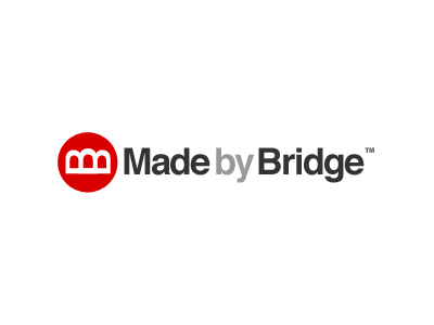
Made By Bridge Logo
This is a logo I've been working on for a web company that I'm a co-founder of. It's a rename and rebrand of an existing company that is merging with another company, and is currently work in progress.
I wanted the icon to be simple, and look like a bridge. I went through lots of variations of this, mostly based around letters ('n', 'm' and upside-down 'u's) that looked like arch or beam bridges.
In this version, I've used two 'B's' on their side, and joined them together (one of them is flipped) to make it look like a bridge. The central part of the bridge being slightly raised as I felt it looked better this way, though possibly less traditionally bridge-like! I also liked using a 'B' for Bridge, as opposed to the 'M' I was using in previous versions.
The font is bold Helvetica, with fairly tight kerning. One of the things I'm unsure of is the small space between the words - I wanted this to work in black and white (as well as colour/greyscale), so felt that a space was needed. Another option I'm considering is to not have the 'by' in bold. We're also considering calling the company 'Bridge' instead of 'Made by Bridge,' so this might be a good workaround to this issue! ;-)
Anyway, this is work in progress, but any feedback or ideas are welcome, thanks.
