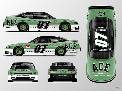
ACE No.3 NASCAR Xfinity Paint Scheme Concept
Conceptual design for my favorite burger spot in Charlotte, ACE No.3. I've been going since day one. With their recent expansion opening close to the race track here I thought it would make sense to see them get in to the sport, and with that "The Ace" is born!
An old school split style scheme with a black roof to bring out the contrast in the logo and numbers. They have an awesome shade of green that would really stand out in the field of cars on track. Also created a pattern out of their flagship burger (The Ace) illustration to give some texture to the livery.
It may be a little early for them to jump into something like this, but I'm telling y'all this place is legit and already working on their 3rd expansion. They're growing fast for a reason.

