Lettering work: feelings
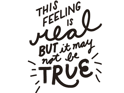
I've been working on this for awhile now but I get to about this point and SHRUG! Here's the deal. I struggled with the top then I liked the type on an angle but then busted out with the rest which I like for how natural it looks but now the looseness of the bottom doesn't fit with the rigidity of the top. Also is it a dash too twee? (Edited to add: the end goal of a lot of these is to cut out for pennants or similar so adding a long drop shadow or too many flourishes won't work)
