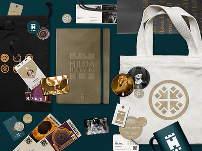
Hilda Hollands Stationary
A brand identity has been created that is dynamic, modern but with a premium longstanding feel. The identity sees 8 separate areas of the museum have their own individuality but work as a cohesive system when paired alongside one another or as a whole. A symbiosis of colour and type see that the areas pull together into the full brand. An over-arching palette of a deep teal colour and gold give the museum a sense of excellence and grandeur whilst the supporting palette allow the other parts of the museum to shine on their own.
A dynamic logo for each exhibit has been based and inspired by the founding members that the names herald to and the primary logo inspired by the pillars that hold the museum up is strong, geometric and scales well between print & digital applications.
Gift shop items have been considered as well as marketing, advertising, tickets, cards & digital design.
You can find me by visiting:
📩 jgunnsdesign@gmail.com
🌐 www.jackgunns.com
@gunns_designs
Thanks!
