Logo Concepts: Crooked House Pies

In 2021, Crooked House Pies, a mom-and-pop business in Burnsville, North Carolina, reached out to me in need of a logo for use on printed material and online.
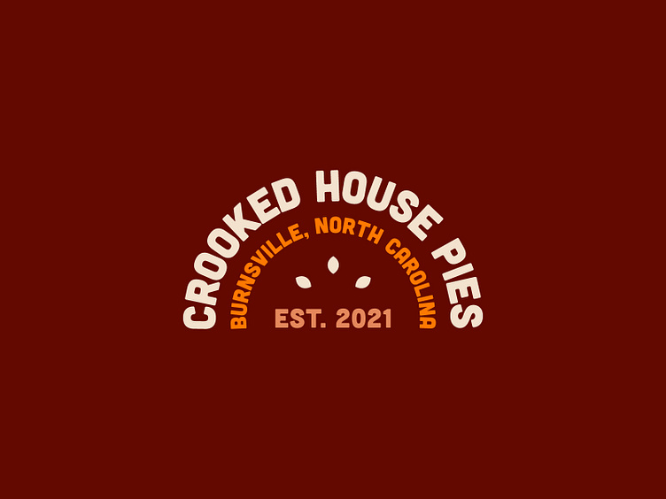
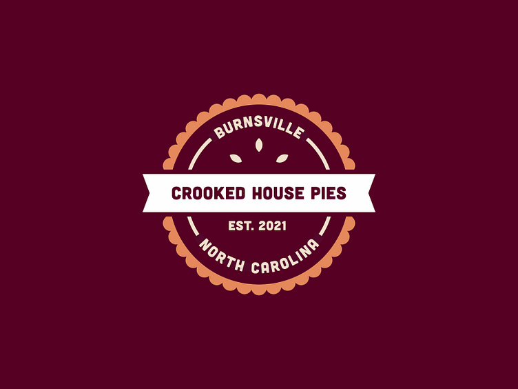
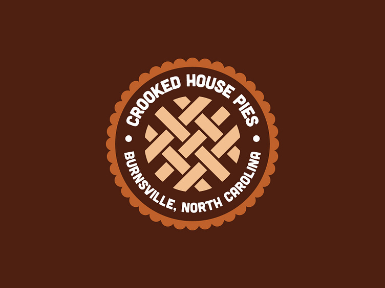
The two-week logo design process began with sitting down with my client, discussing their business values, and identifying three adjectives that their new logo would reflect. The client expressed that they wanted something rustic and artisanal looking. Moreover, they specifically wanted to avoid the "slick, sterile, and corporate" design aesthetic. In essence, they wanted something fitting for a small pie shop in a small town. After much deliberation, the client chose the adjectives "rustic, artisanal, and understated."
Upon completion of the first client meeting and filling a page with ideas in my sketchbook, I scanned my sketches into Adobe Illustrator and vectorized my fifteen best logo concepts in black and white. Eventually, I would narrow the fifteen logos down to my five best options before exploring color and presenting them to the client.
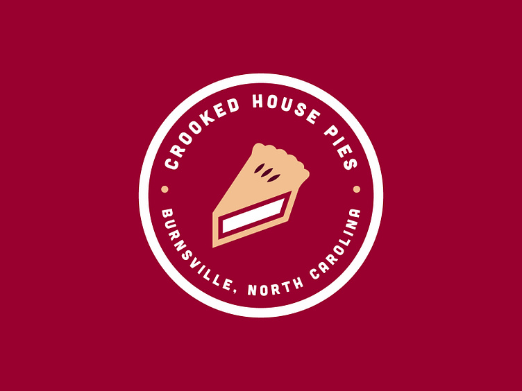
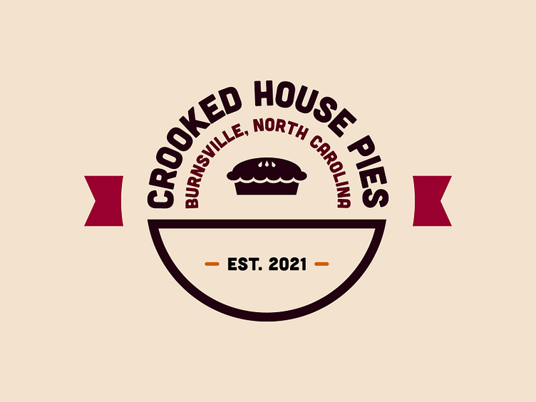
The client ultimately chose the concept located on the bottom right-hand corner of my main project shot (the logo with an icon of a whole pie in the center and ribbons on both sides). The owner of Crooked House Pies expressed that the brown and berry red tones used in this concept were the "most appetizing and reminiscent of pie."
