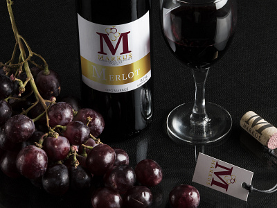
Winery OPG Markus
OPG Winery Markus is a project for traditional local vinery. Since everything is made and harvested on the property, they have name “OPG” meaning family farm. They are mostly doing business in wine industry we decided to do a logo with letter “M” standing for family name incorporated with raceme (group of grapes). Therefore, we conceptualized letters o, p and g into one stylized raceme.
Additionally, design was focused on labels that come in two variations – basic and grand. Basic is used for wines that do not have any special prizes while grand has gold foil and is used for archived and special wines. In order to have whole package logo was incorporated on cork and tag.
More by Filip Cancer View profile
Like
