Notifications
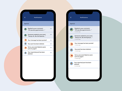
My exploration on Notifications page for Tell app, an app which you can exchange message and stories with others in anonymous.
I made two designs, the initial design is similar with the left one that looks a bit compact, and then I added extra spacing to the second design (the right one) so it looks more spacious. The unread notifications would be the ones with the blue and read notif would be the white ones.
Which one do you prefer, the compact or the spacious one?
I wrote the journey of making this design here.
More by asry View profile
Like
