Neptune Iteration 1
Neptune is the name of an internal team I am part of, used it as a quick warm-up branding exercise (disclaimer: I am not a professional designer... but I'd like to get into this space!)
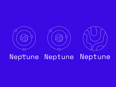
My choices:
- I chose the colour blue since Neptune is associated with the ocean and aquatic life, I went with a 'royal' or 'rich' blue, since Neptune is the God (which some may interpret as a type of King) of the sea in Roman mythology. Blue is also most commonly used with tech and social media (which is related to where this team sits in the industry).
- I chose the font 'Space Mono', since Neptune is also the name of a planet in our solar system, which is also the reason behind the planetary monoline illustrations. The font also fit the sans-serif and minimalistic/web-friendly concept I had in mind.
- The first iteration included a play with the letter 'T' to resemble a trident, Neptune's weapon.
