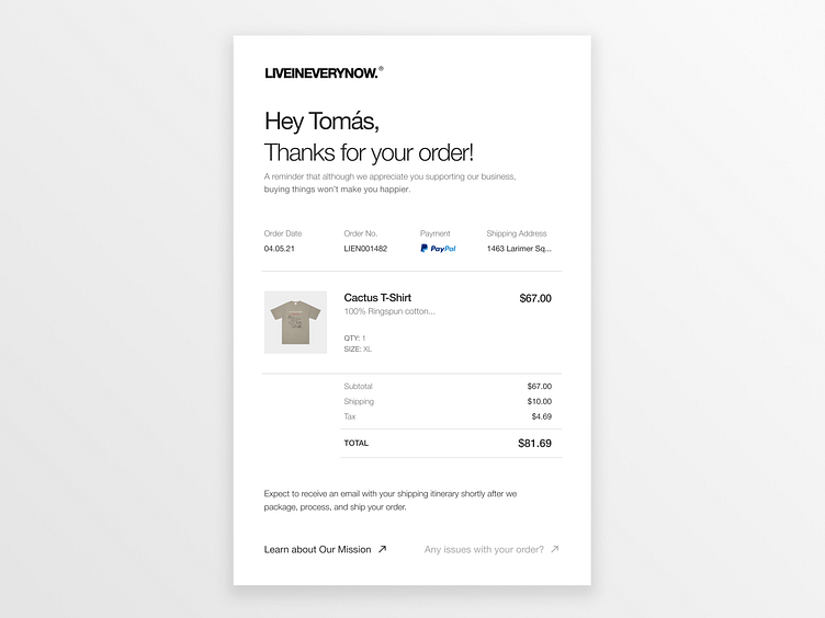
Daily UI 17 - Email Receipt
Prompt: "Design an Email Receipt. What was purchased? On what date? Consider other elements such as a customer support info, a tracking number, pictures, related items, etc."
Solution: Besides fulfilling the challenge today I was focused on making a clean experience that didn't feel "appy." I feel as if I see rounded corners, hovering buttons, and extreme gradients adnauseam these days. At this point, we all can execute that look. From a UI perspective, I was going for a clean white-space-endearing and flat, UI. You'll notice text-based buttons with no fill that when hovered may change colors or something to that avail.
This is also a designed potential email receipt for my brand @liveineverynow (https://liveineverynow.com) where we're focused on giving people the tools to live happier, healthier, and more present lives -- hence the reminder message at the top of the email "...buying things won't make you happier." If you're interested in knowing more, check out our podcast on all streaming services!
Moreover, if you've got feedback for me, I'd love to hear it. Thank you for viewing. Cheers! 👋🏼
