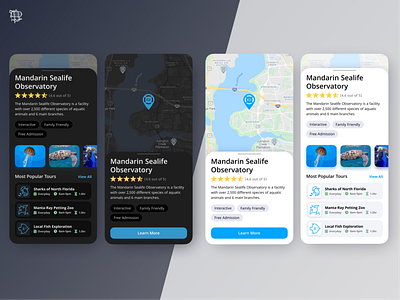
Dark Mode vs Light Mode
When designing an app or website in Light Mode, there are some things that we often use to make the UI better. Bright colors against the white work well to make the design pop, drop shadows are used to create a sense of depth on a flat screen. When we design UI that is in dark mode or maybe includes a dark version, is it a 1-1 trade? NO!
Dark mode should use different strategies to create a better UI. Desaturated colors make the screen easier to look at and different shades of black should be used instead of drop shadows.
Learn more about Airship:
About | Services | Contact Us
More by Airship View profile
Like
