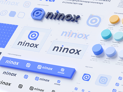
Ninox design system, ui kit, style guide, web designer
Ninox transformation with a new interface visual layout
Together with our partners from the client team, we built a hypothesis that the outdated visual style couldn't make the users believe in Ninox's high-quality features.
Thus, creating low customer retention. We did not make any tremendous changes to all UI/UX elements. Instead, our corrections were slight and had more of a visual impact on the overall picture that simplified a screen navigation process.
Concurrently, producing a feeling of a refreshed and modern product. As a result, the number of users who went from trial to paid product versions increased by 21%, and the retention rate raised from Day-1 (57%) to Day-7 (59%).
More by Ramotion View profile
Services by Ramotion
Like
