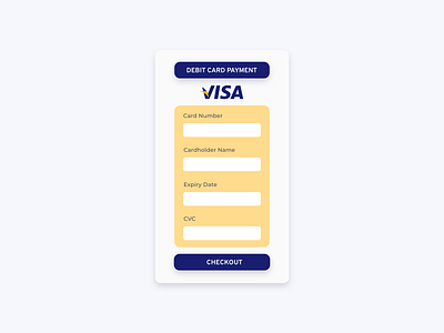
Daily UI Challenge #2 - Credit Card Checkout
I wanted to have a clean and classic design as credit card checkouts normally have a "serious" sort of vibe. On the other hand, I wanted to inject a bit of a cheery and lighter tone so I decided to use the brand colours of VISA to page the interface more visually appealing.
More by Rasyiqah View profile
Like
