LOGO - MIYOKO
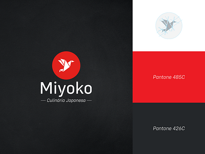
The symbol consists of a tsuru's origami transmitting happiness, health and prosperity. Its application in a red circle connects with the crimson sun of the Japanese flag, strengthening the connection of the establishment with the cuisine of the land of the rising sun.
The colors red, black and white were chosen because they are directly linked to Japan. The color red is also one of the colors linked to the food industry used to instigate hunger. The black color also transmits seriousness and luxury to the brand.
More by Luiz Curado View profile
Like
