Museum and Observatory Locator
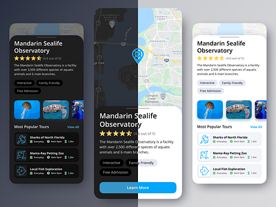
What do you think about my newest design, exploring how a light mode and a dark mode would look for an app where a user can find sea life museums and observatories?
In designing dark UI, it is important to think about the saturation of colors! Very saturated colors can be difficult to look at against black. When you design a dark UI, it is better to desaturate the colors.
A tip for doing this: Switch your color mode from HEX to HSL, and drop down the S (saturation) until it is at a good level.
When designing Light UI's, going with a bolder, more saturated color is normally a better option.
What do you think?? Do you agree? I would love to hear your thoughts in the comments below!
More by Tyler Honeycutt View profile
Like


