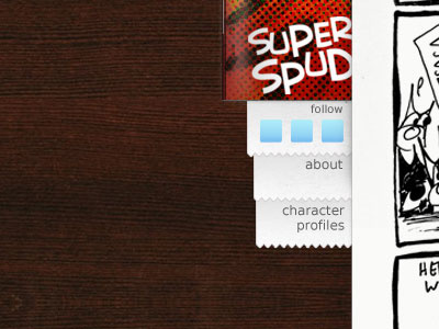
Another web redesign!
This is another mock up for the redesign of my webcomic site. My previous post had, well, a previous mockup which I felt didn't have enough oomph. Wood pattern and jpg don't seem to mix well. I guess I'll have to save it at maximum instead of high.
More by Daniele Rossi View profile
Like
