Ollie | Brand Identity & Package Design
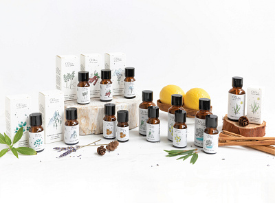


Handpicked from nature, poured in a bottled, curated with love and care, Ollie came to us to transport this idea into their branding and packaging.
Approaching the theme, we broke down the plan into two simple sections; pure and personal. Nothing defines purity better than the colour white, which is what we chose for our base and background.
To represent Ollie’s intimate and personal approach, the white base was filled with hand-drawn illustrations that are deliberately kept rough around the edges to make them look like it's directly been sourced from a farmer's pen.
The result being, a simple, straight from the heart and fuss-free design route depicting the brand’s ideologies and boundary-less character.
