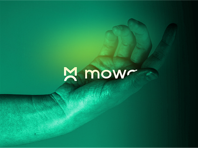
MOWA - BRANDING
PROJECT: https://www.behance.net/gallery/117784687/MOWA
The concept for creating the mowa brand is based on the joining of the letters of M and O. The letter O cut in half forms an arc raising the letter M upwards, thus referring to the idea of development, evolution. We can also interpret the letters as M and A, so we have the first and last letter of the word MOWA, which is also the name of the owner of the company Matheu Anstenn.
More by artsigma View profile
Like

