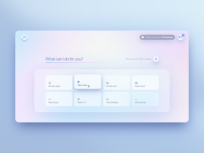
Natural AI Desktop redesign
Despite their tagline being "Say it, and get it," I can't say I fully grasp why Natural AI is a product, and not just part of Alexa, Siri, Cortana or Google Assistant. Maybe they're just looking to get an acquisition (or perhaps...an acquihire—after all, Laurene Powell Jobs is one of their key investors).
Frankly, I find most chatbots and virtual assistants extremely annoying to use. Having said that, Gleb Kuznetsov is popular for a reason. In the same way that Stripe and Benjamin De Cock did, he pushes the motifs that are already pervasive, and tries to take them to their logical conclusions. And he does so prolifically. He's not quite doing visual speculative futuring, so much as visual 'presenting,' but with a more aggressive stance.
But more than his technical craft, which is usually 99th percentile, what Gleb is able to do more than anything is capture a mood. It probably comes from his days at Fantasy Interactive. They move fast.
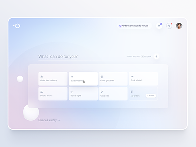
In some cases, details may be missed. For instance in the shot I'm rebounding here there are a bunch of issues that I'll list shortly. But nonetheless, this was a useful exercise to attempt to push past something that had already been pushed to an extreme.
Assorted changes:
* Improved contrast—the original severely lacked it.
* Removed inconsistencies like the clock icon in the Order time notification being different treatment than the 3 badge on the shopping cart, being different size and color from the red notification treatment
* Fixed alignments—see the 3 in the shopping cart badge, or the bottom-heavy “S to speak”, the “2 active,” or the tiles themselves which seem uncomfortably vertically centered
* Removed the query history—there’s really no need for that in an AI virtual assistant UI
* Increased margins between the tiles
* Improved surface dimensionality
* Improved the query underline so it looks interactive (and visible at all)
* Removed the floating balls in the background—very distracting and take away from the cleanliness of the composition
* Added various flourishes
See the original shot by Gleb
See the @1x
See the @2x

