Heyday – Mobile App
Last year I was the designer on the design sprint for Heyday, a skincare brand.
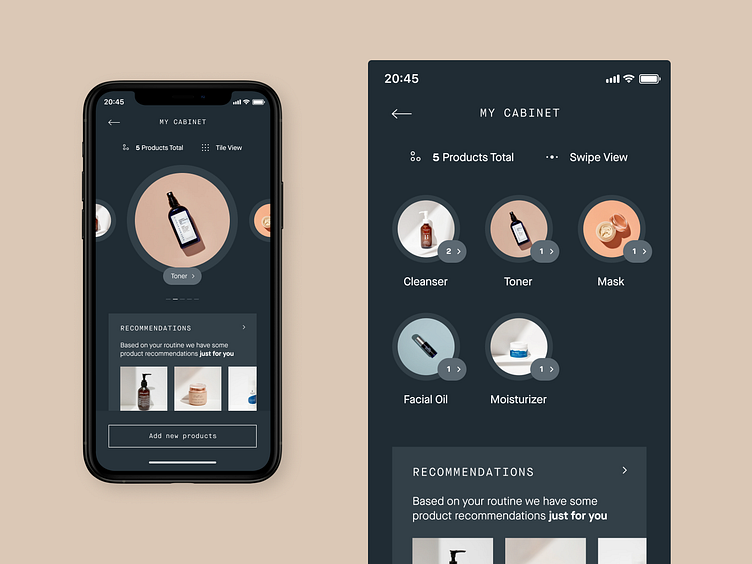
There were 9 total different prototypes at the end and this is one screen of those iterations.
At some point, we decided to change the word shelf to the cabinet. This is the dark UI cabinet screen where you can see all your available products for skincare routines.
Press "L" to show some love and any love is appreciated. 😉
If you like, follow me for regular updates. ✌️
More by Victor Berbel View profile
Like
