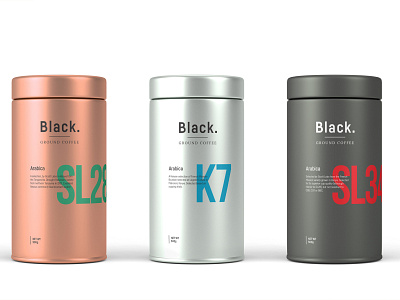
Black. Ground Coffee Cannister and Logo design
In all honestly I’m a pretty big coffee freak; I set out to develop a simple, clean, minimalist packaging design strictly based on typography.
Before the development, sturdy research was conducted, so I knew what I can lean towards, with that being said I was not looking to make a typical design with coffee grounds or coffee cup. I wanted the design to depicting the product.
More by Ted Vesania View profile
Like
