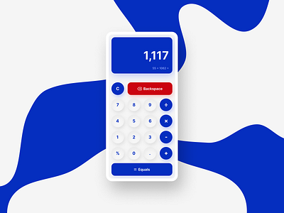
Mobile Calculator UI
To me this feels a little bare but still successfully covers the basic UI necessary for a calculator. More could have been done to support more features of calculators. As the end aesthetic I am quite pleased and feel like I managed to balance my scale relatively well.
More by Haydon View profile
Like
