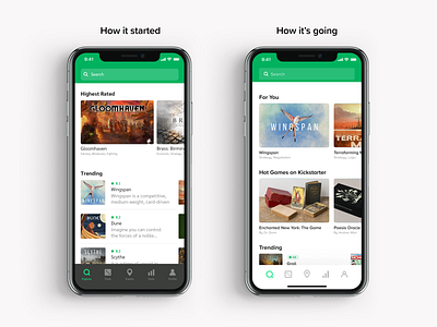
Cardboard Companion – UI Update
I did my first design of Cardboard Companion about 2 and a half years ago. The design on the left shows our current implementation, and the right shows the new one.
Every screen from the explore page to profiles and events has been revisited. When I started designing this app I made a ton of rookie mistakes. Now I have improved the visual hierarchy, color systems (for when we implement dark mode), used consistent UX patterns in line with mobile best practices, and it adheres to the base 8 standard.
Press "L" if you like it!
I’m a Southern California-based designer with experience building brands and products for companies ranging from early-stage startups to Fortune 100 companies. Currently building a new online checkout experience at Square.


